Have you ever used an app or website that felt so natural, so smooth, that you didn’t even think about how it worked? You just used it. No confusion. No frustration. No learning curve. That feeling isn’t accidental—it’s the result of Invisible Design UX.
Invisible design is the quiet hero of great digital experiences. It doesn’t shout for attention with flashy visuals or complicated features. Instead, it gently guides users, anticipates their needs, and removes friction before they even notice it exists. When design is done right, users don’t praise the interface—they praise how easy everything feels.
In today’s crowded digital world, where users have endless choices and very little patience, invisible UX design has become more important than ever. This article explores what invisible design UX truly means, why it matters, how it works, and how designers and businesses can apply it to create effortless, human-centered experiences.
ALSO READ: Numerology 8 And 8 Explained: Balance Power And Destiny
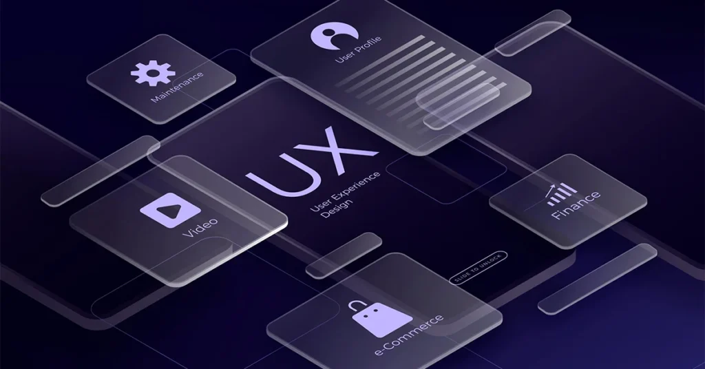
What Is Invisible Design UX?
Invisible Design UX refers to a design approach where interfaces and interactions feel so intuitive that users don’t consciously notice the design itself. Instead of drawing attention to buttons, menus, or layouts, the design quietly supports the user’s goals.
The focus shifts from how the product looks to how it feels to use. Invisible UX removes unnecessary elements, simplifies decisions, and allows users to complete tasks with minimal effort and mental load.
In simple terms:
- Visible design impresses users
- Invisible design serves users
When design becomes invisible, usability becomes unforgettable.
Why Invisible Design UX Matters More Than Ever
Users Expect Effortless Experiences
Modern users compare every digital experience to the best ones they’ve ever had. If your product feels confusing or slow, they won’t try to understand it—they’ll leave.
Invisible Design UX meets users where they are and respects their time.
Reduced Cognitive Load
Every decision, click, or second of confusion drains mental energy. Invisible design minimizes thinking by:
- Reducing choices
- Using familiar patterns
- Presenting information at the right moment
Less thinking means happier users.
Better Engagement and Retention
When users don’t struggle, they stay longer. They return more often. And they’re more likely to recommend your product to others.
Invisible UX doesn’t just improve usability—it improves loyalty.
The Core Principles Of Invisible Design UX
Clarity Over Creativity
Invisible design doesn’t mean boring design. It means clarity always comes first. Creativity supports usability, not the other way around.
Clear labels, predictable actions, and understandable layouts help users move forward without hesitation.
Familiar Patterns Win
Users already know how most digital products work. Invisible UX embraces familiar navigation, icons, and interactions instead of reinventing everything.
When users don’t have to learn, they feel confident.
Less Is More
Every extra element is a potential distraction. Invisible design removes:
- Unnecessary buttons
- Redundant text
- Decorative elements that don’t add value
What remains is purpose-driven design.
How Invisible UX Reduces Friction
Anticipating User Needs
Great UX doesn’t wait for users to ask—it predicts what they’ll need next. This could mean:
- Autofill suggestions
- Smart defaults
- Context-aware options
When users feel understood, the experience feels magical.
Guiding Without Forcing
Invisible design gently nudges users in the right direction without making them feel controlled. Visual hierarchy, spacing, and subtle cues guide behavior naturally.
The user stays in charge, but never feels lost.
Preventing Errors Before They Happen
Instead of showing error messages after mistakes, invisible UX prevents errors through:
- Clear instructions
- Real-time validation
- Smart constraints
The best error message is the one users never see.
Invisible Design UX vs. Minimalist Design
Invisible design is often confused with minimalism, but they’re not the same.
- Minimalist design focuses on reducing visual elements
- Invisible UX focuses on reducing user effort
A design can look simple but still feel confusing. Invisible UX ensures simplicity works in favor of usability, not just aesthetics.
Real-World Examples Of Invisible UX
Search Experiences
The best search tools don’t explain how they work—they just work. Autocomplete, smart suggestions, and accurate results make searching feel effortless.
Onboarding Flows
Invisible onboarding teaches users by letting them do, not by overwhelming them with instructions. Tooltips, progressive disclosure, and guided actions replace long tutorials.
Checkout Processes
The smoothest checkout experiences feel almost invisible:
- Fewer steps
- Clear progress indicators
- Minimal required information
Users complete purchases without second thoughts.
The Role Of Microinteractions In Invisible UX
Microinteractions are small design responses to user actions—like a button changing color when clicked or a subtle animation confirming success.
In invisible UX, microinteractions:
- Provide feedback without distraction
- Reassure users their action worked
- Add clarity without noise
They’re felt more than seen.
Content Design And Invisible UX
Words are part of the user experience. Invisible UX uses language that feels natural and human.
Simple, Clear Copy
Avoid jargon. Use everyday language. Short sentences guide users better than long explanations.
Helpful, Not Pushy
Error messages, confirmations, and prompts should feel supportive, not blaming or robotic.
Good UX writing disappears into the experience.
Accessibility: The Foundation Of Invisible Design
Invisible UX is inclusive UX. When design works for everyone, it truly becomes invisible.
Accessible design includes:
- Clear contrast and readable text
- Keyboard-friendly navigation
- Logical structure for screen readers
Accessibility doesn’t add complexity—it removes barriers.
Designing Invisible UX Is A Process Not A Shortcut
User Research Comes First
You can’t design invisible experiences without understanding real users. Interviews, usability tests, and behavior analysis reveal friction points.
Test, Learn, Improve
Invisible UX is refined through iteration. Designers observe where users hesitate, get confused, or drop off—and then remove those obstacles.
The goal is continuous improvement, not perfection.
Common Mistakes That Break Invisible UX
Over-Designing
Too many animations, colors, or features pull attention away from the task.
Designing for Designers, Not Users
What looks impressive to a designer may confuse a user. Invisible UX always prioritizes real-world use.
Ignoring Context
A design that works on desktop may fail on mobile. Invisible UX adapts to device, environment, and user intent.
How Businesses Benefit From Invisible Design UX
Higher Conversions
When users don’t struggle, they act. Sign-ups, purchases, and interactions increase naturally.
Lower Support Costs
Clear, intuitive experiences reduce the need for help centers and customer support.
Stronger Brand Trust
Users trust products that respect their time. Invisible UX builds that trust quietly and consistently.
The Future Of Invisible Design UX
As technology evolves, invisible UX will become even more important. AI-driven personalization, voice interfaces, and contextual experiences will push design further into the background.
The future isn’t about more screens or more features—it’s about less effort.
Designers who master invisible UX will shape experiences that feel human, helpful, and effortless.
Conclusion
Invisible Design UX is not about hiding design—it’s about letting users shine. It removes friction, reduces thinking, and creates experiences that feel natural and intuitive.
When users don’t notice the interface, they focus on what truly matters: achieving their goals. That’s the real art of effortless user experiences.
In a world full of noise, invisible UX is the quiet advantage that separates good products from unforgettable ones.
FAQs
What is invisible design UX?
Invisible design UX is an approach where interfaces feel so intuitive and effortless that users don’t consciously notice the design while using a product.
Why is invisible UX important for users?
It reduces confusion, saves time, and makes digital experiences feel natural and stress-free.
Is invisible UX the same as minimal design?
No. Minimal design focuses on visuals, while invisible UX focuses on reducing user effort and friction.
How does invisible UX improve conversions?
By removing obstacles and simplifying decisions, users complete actions more easily and confidently.
Can invisible UX work for complex products?
Yes. Invisible UX is especially valuable for complex tools because it simplifies workflows and guides users naturally.
ALSO READ: Timeless Black Inspirational Quotes For Everyday Motivation